Rated as 0 (0 Votes)
Add to Cart widget
Add Shopping Cart and the Add to Cart button to your page.
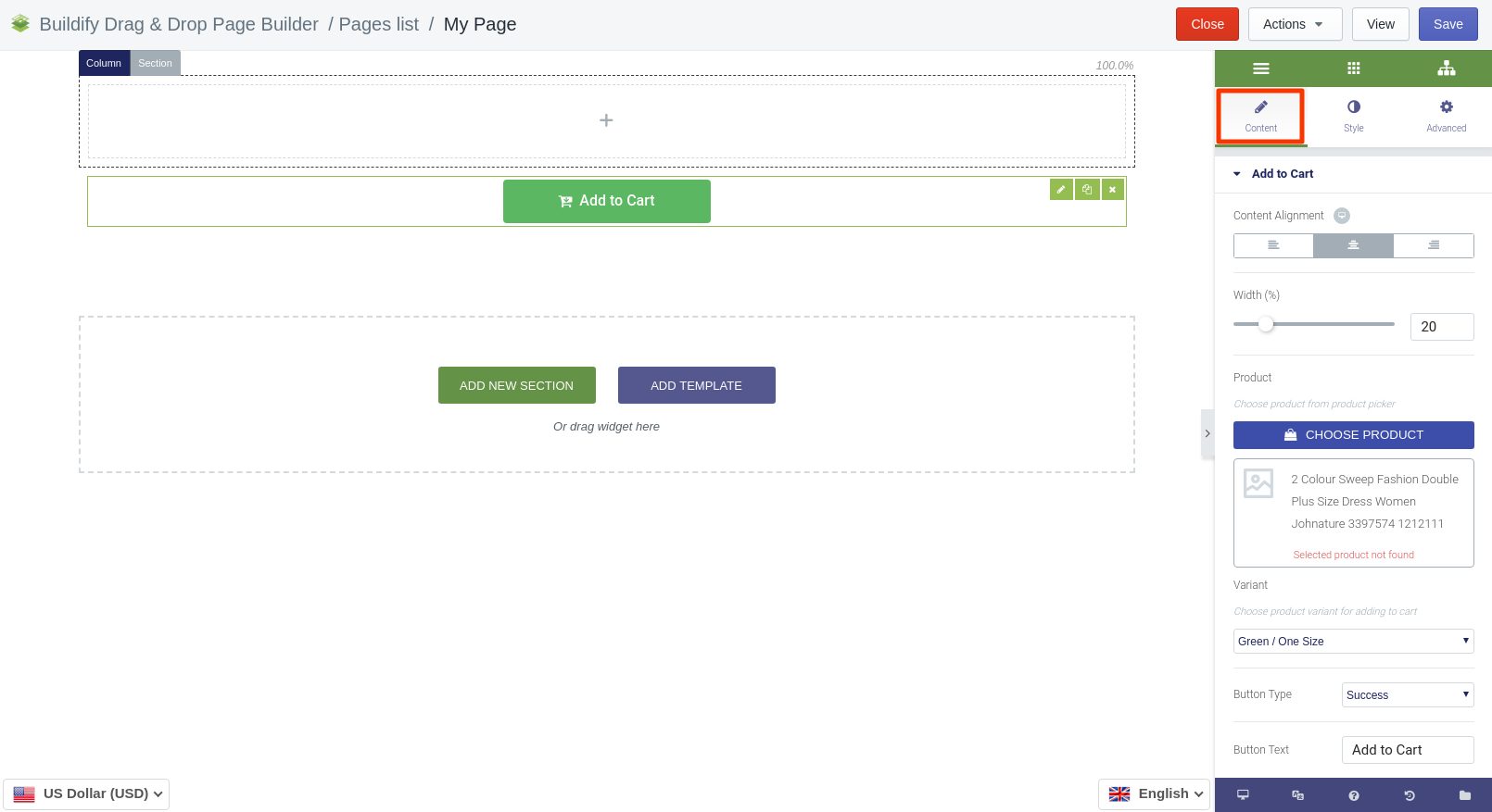
To customize the Add to Cart widget, add a product to Cart. Do that in the Content section. Press the Choose Product button and select an item.
Content Settings
Add to Cart
- Alignment - the position of the button on the page.
- Width - the width of the button.
- Product and variant - choose a product and a variant of the product.
- Button type - the color of the button.
- Button text - the text on the button.
- Button size - the size of the button (extra large, large, medium, small, extra small).
- Icon - the icon of the button.
- Icon position - the position of the icon: before or after the text.
- Icon spacing - set the distance between the text and the icon.
- Additional products - allow submitting additional products.
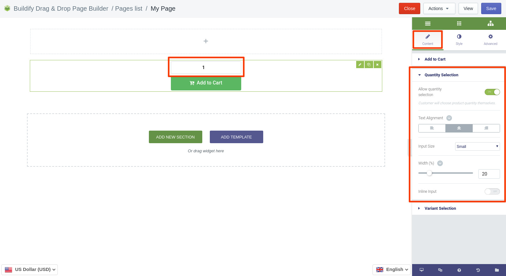
Quantity Selection
If you enable quantity selection, customers will be able to indicate the quantity of the product by themselves. You will then need to set:
- text alignment;
- input size;
- width;
- position (put the button under or inline with Add to Cart button).
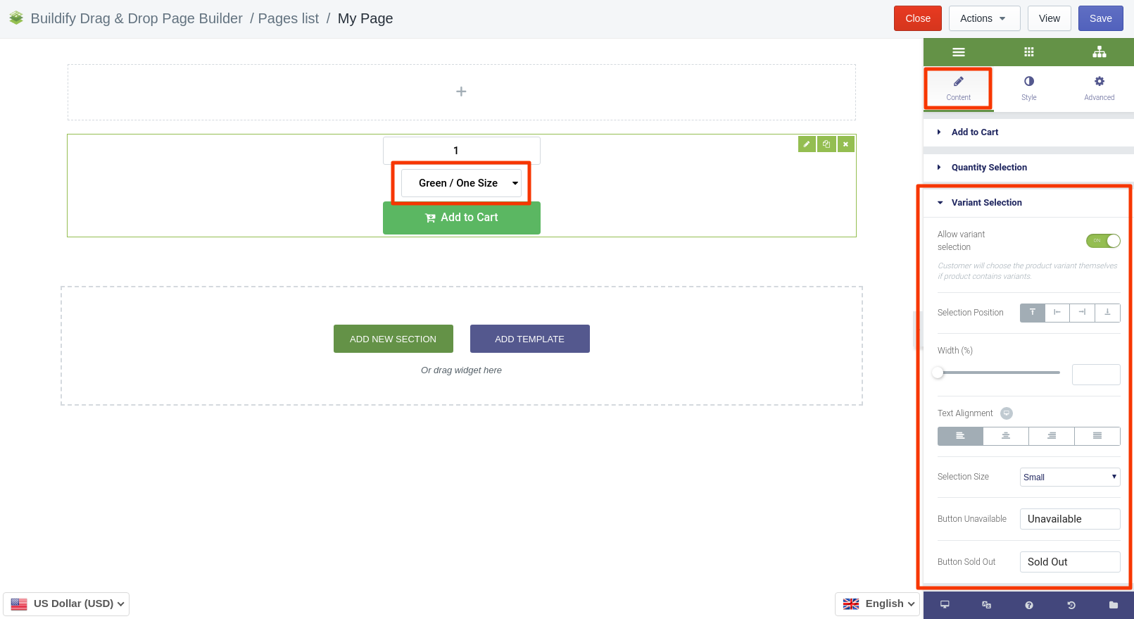
Variant Selection
Enable selection of variants, if there are any for the product, and if you want customers to choose variants themselves.
- Position - set position of the selection section.
- Width - set a width of the button.
- Text alignment - set text alignment inside the button.
- Selection size - set the size of the selection section.
- Button unavaible - enter appropriate text.
- Button sold out - enter appropriate text.
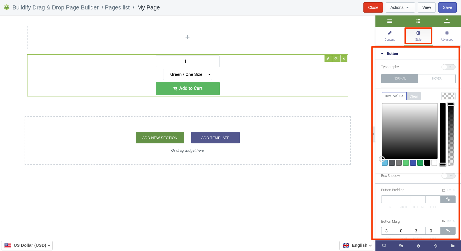
Style Settings
Button
The following setting are available for the Normal position:
- Typography
- Text and background color
- Border type and radius
- Box shadow
- Button padding and margin
The following setting are available for the Hover position:
- Color settings - text, background, border color.
- Animation - set the animation for the section.
- Border type and radius.
- Box shadow - add special effects for the button.
- Button padding and margin.
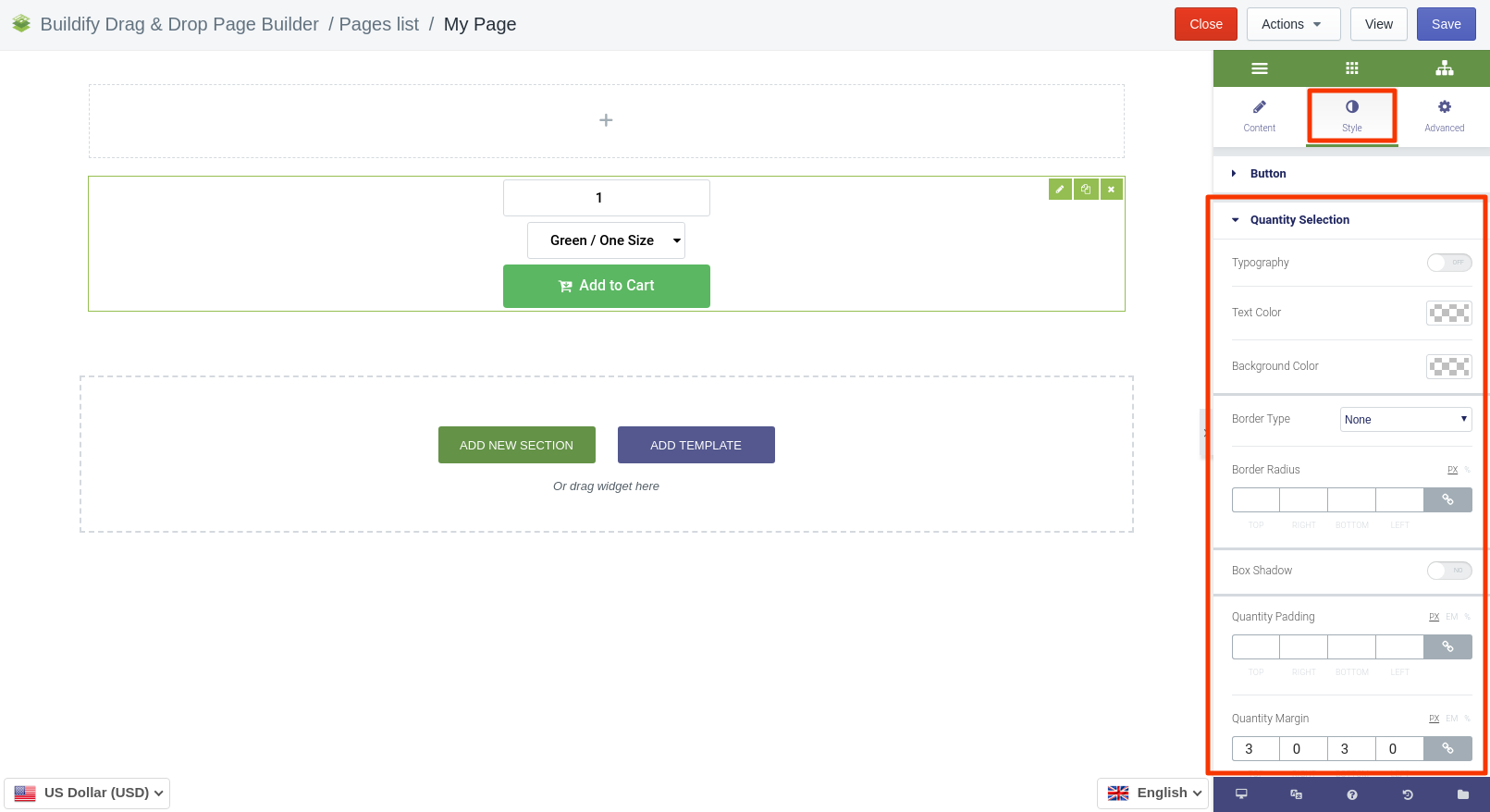
Quantity Selection
- Typography
- Text and background color
- Border type and radius
- Box shadow
- Quantity padding and margin
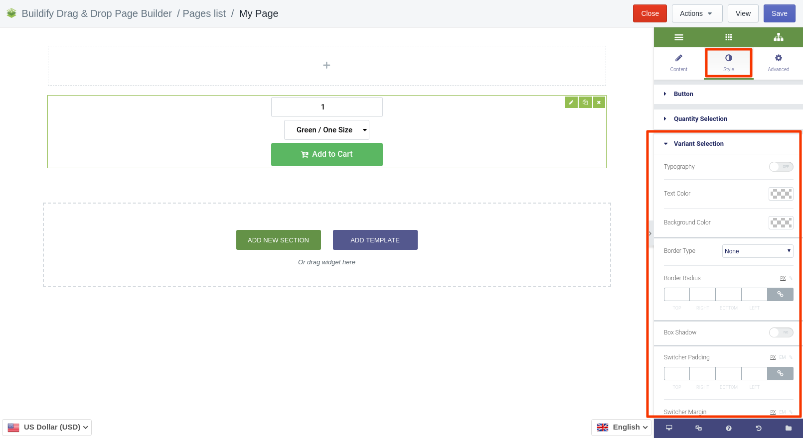
Variant Selection
- Typography
- Text and background color
- Border type and radius
- Box shadow
- Switcher padding and margin
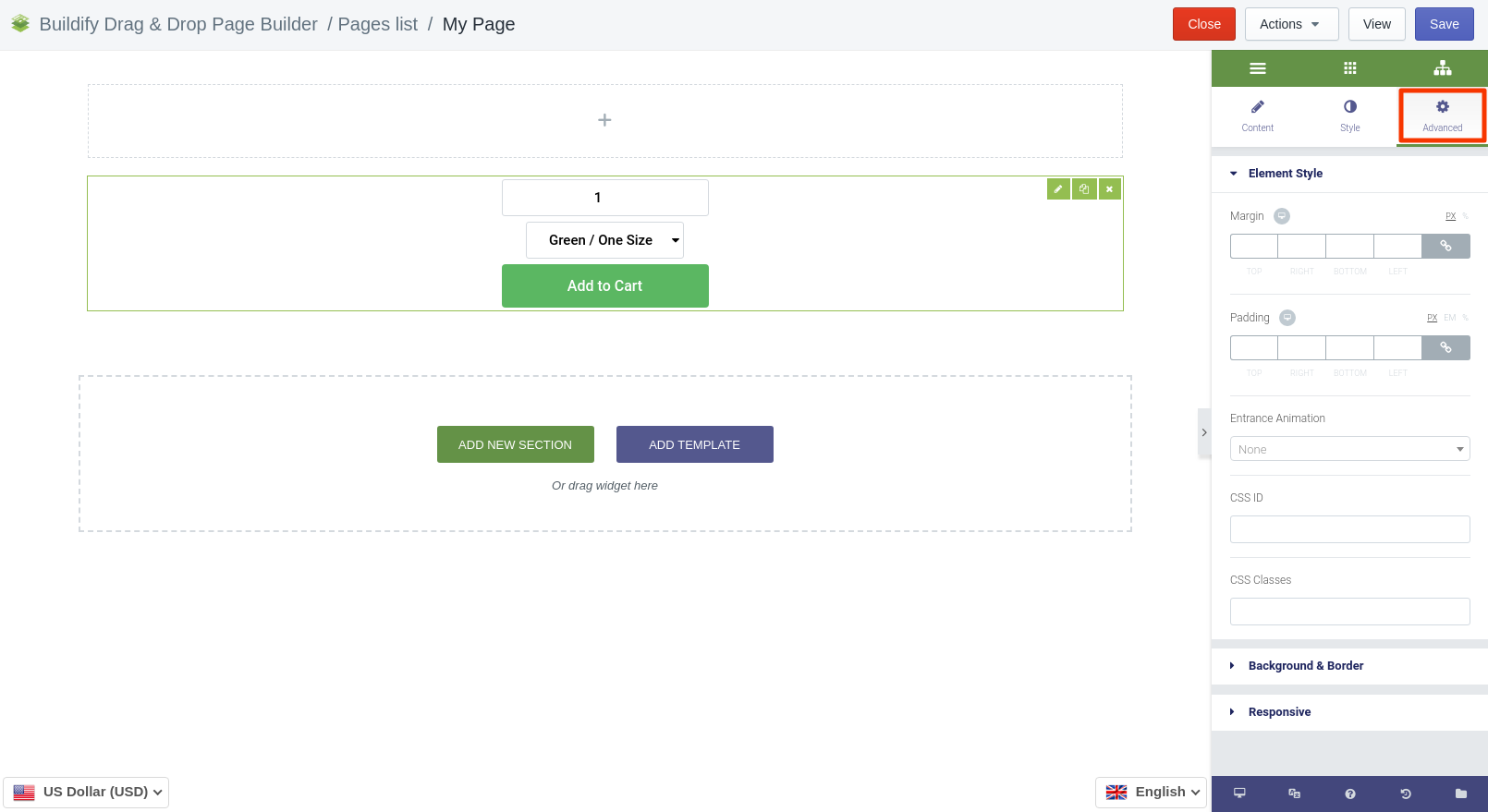
Advanced Settings
- Element Style (margin, padding, entrance appearance).
- Background & Border (type, radius, box shadow).
- Responsive (hide or show it on a desktop, tablet, mobile).