Rated as 0 (0 Votes)
Buttons Group widget
Group your buttons in one place in order to make page structure more convenient for customer.

The Buttons Group widget allows grouping related buttons into one block.
Content Settings
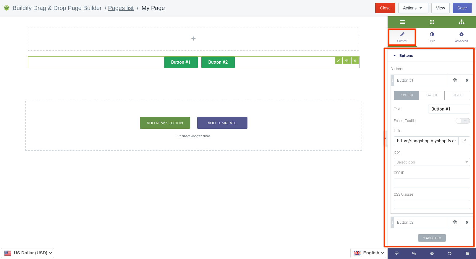
Buttons
In this section you will see a list of buttons. Add a new button by clicking on the Add item button. To edit the button, click on the cell of the button in the Settings window. The page has three options to configure:
- Content - enter text, link, CSS ID and Class, choose an icon for the button.
- Layout - set size and width, align the text.
- Style - set custom styles that will only affect this specific button.
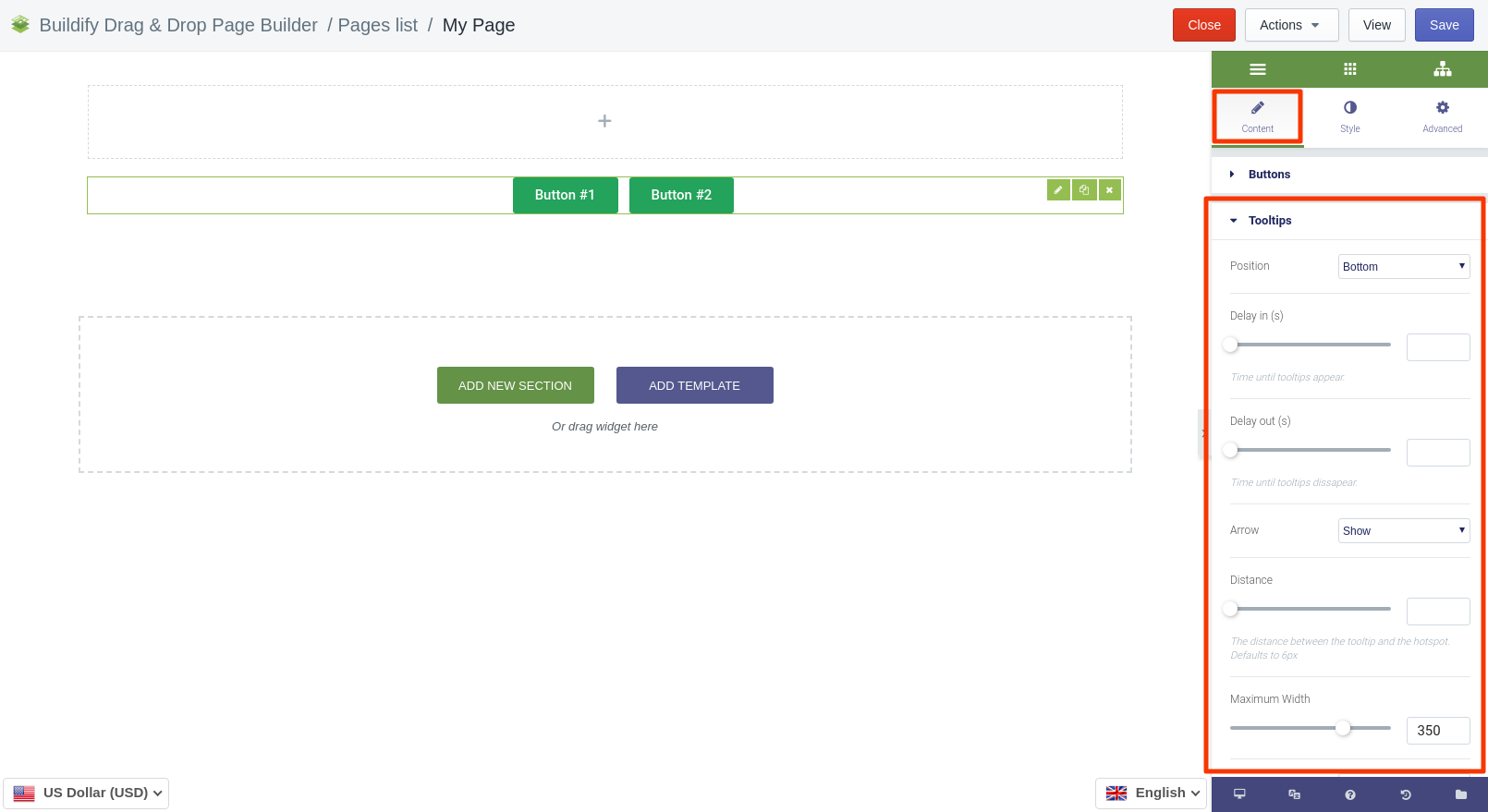
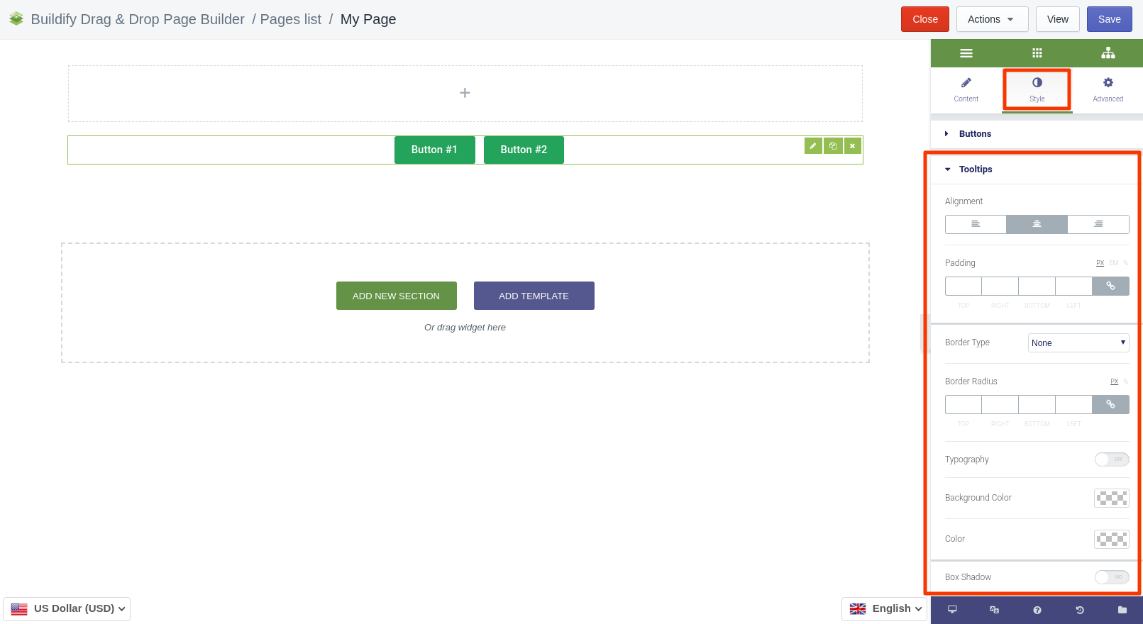
Tooltips
- Set position.
- Delay in - time until tooltips appear.
- Delay out - time until tooltips disappear.
- Show or hide arrow.
- Set the distance between the tooltip and the hotspot. Defaults to 6px.
- Set maximum width.
Style Settings
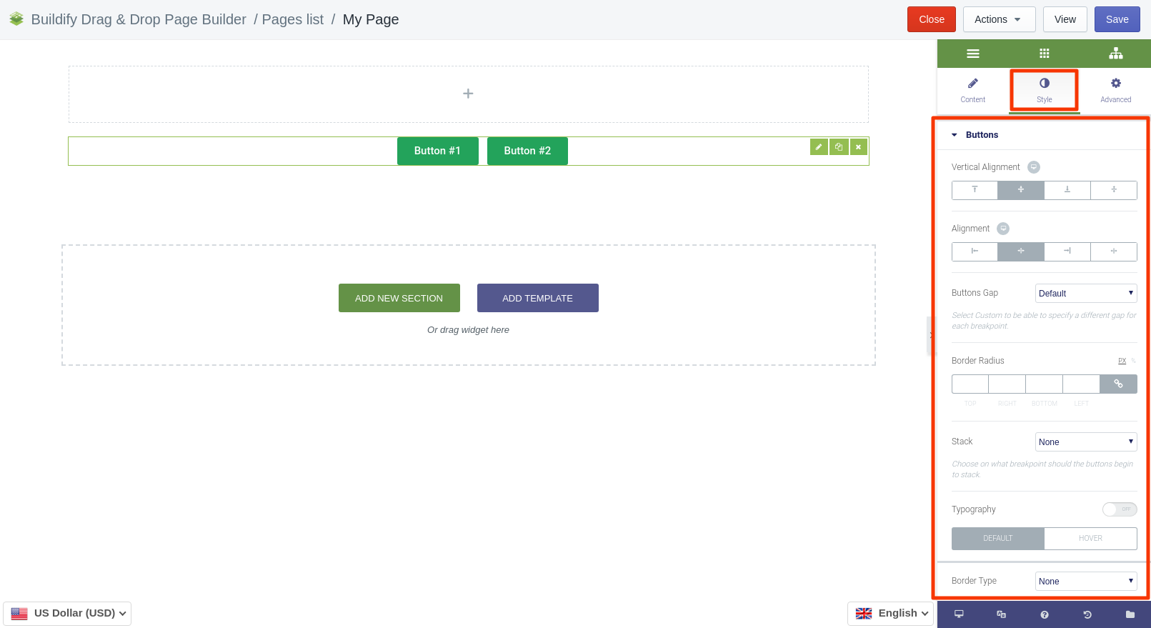
Buttons
- Set vertical and horizontal alignment.
- Set buttons gap.
- Set border radius.
- Choose on what breakpoint should the buttons begin to stack.
- Make typography settings - set size, font, style, letter spacing, etc.
for Normal position are available next settings:
- Choose border type.
- Set text and background color.
- Set box shadow.
for Hover position are available next settings:
- Set text, background and border color.
- Set box shadow.
Tooltips
- Set alignment of buttons.
- Set padding.
- Set border type and radius.
- Typography - set size, font, style, letter spacing, etc.
- Set background and main color.
- Set box shadow.
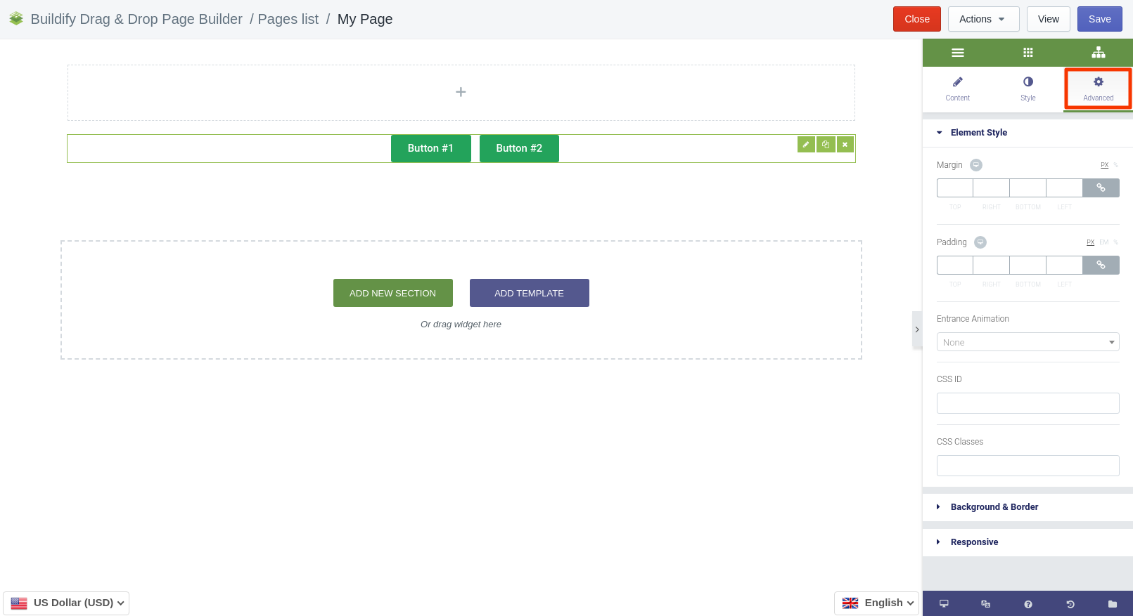
Advanced Settings
- Element Style (margin, padding, entrance appearance).
- Background & Border (type, radius, box shadow).
- Responsive (hide or show it on a desktop, tablet, mobile).