Rated as 0 (0 Votes)
Circle Progress widget
Add a circle progress bar and style it to your preference.
The Circle Progress widget is used to show an animated progress (loading) circle-bar representing a percent value towards the completion of some operation.
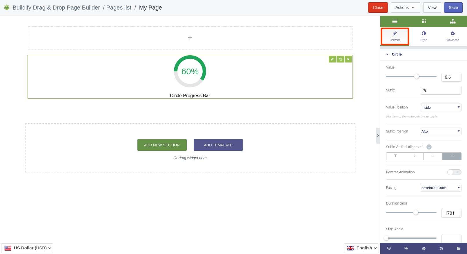
Content Settings
for Circle
- Value - set the value of progress.
- Suffix - set the suffix (for example, percents).
- Value position - choose where to place the value (inside or below the circle).
- Suffix position - choose where to place the suffix (after or before the value).
- Suffix vertical alignment - choose the vertical position of the suffix.
- Reverse animation - if you want to change the direction of animation.
- Easing - choose the type of animation.
- Duration - set the duration of animation (from highest to lowest).
- Start angle - choose the position for the animation to start.
- Appear offset - specifies the offset, relative to when the widget enteres the viewport, after which the animation starts.
for Text
Edit text with a simple text editor.
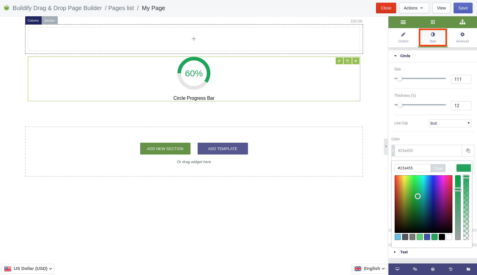
Style Settings
for Circle
- Set up the size of the circle.
- Set up the thickness of the circle.
- Choose line capacity (it can be butt, round and square).
- Choose the color of the circle.
- Set up the gradient angle.
- Choose the color for empty part of the bar.
for Value
- Color - choose the color of value and suffix.
- Typography - set size, font, style, letter spacing, etc.
for Text
- Color - set text color.
- Typography - set size, font, style, letter spacing, etc.
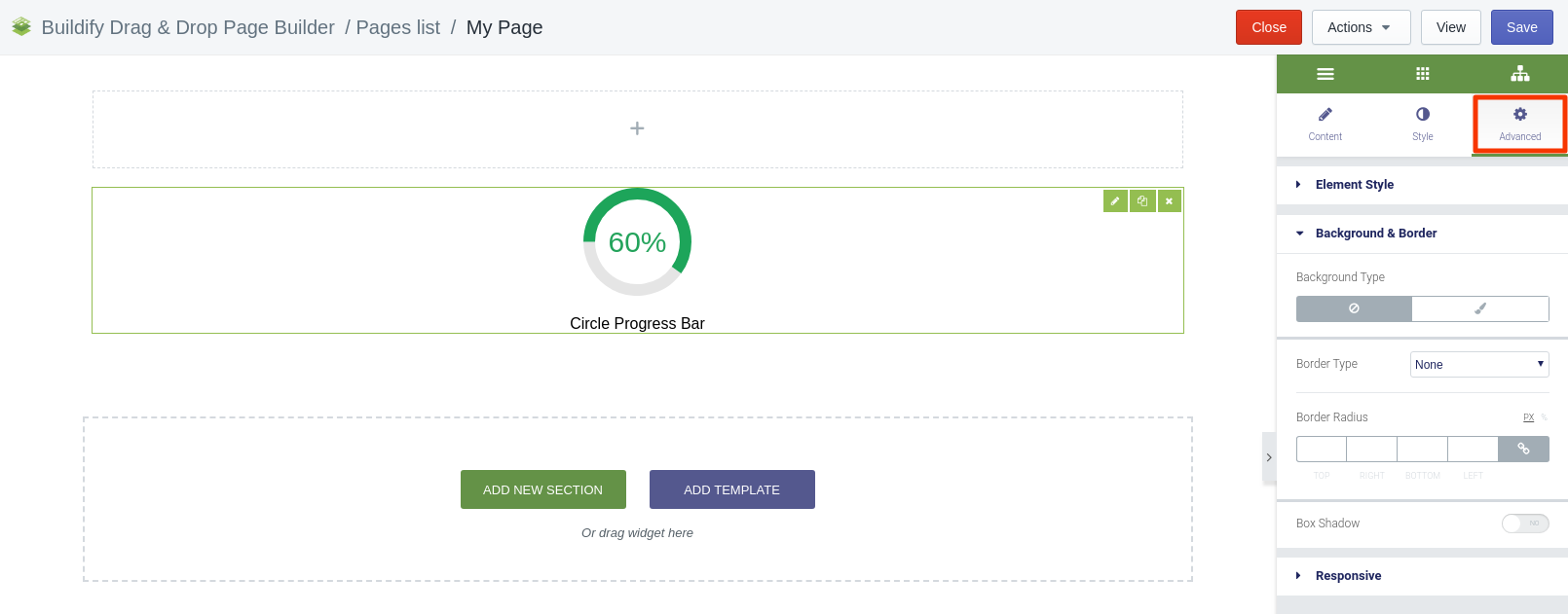
Advanced Settings
- Element Style (margin, padding, entrance appearance).
- Background & Border (type, radius, box shadow).
- Responsive (hide or show it on a desktop, tablet, mobile).