Rated as 0 (0 Votes)
Collection Product widget
Add a box of collections and products within the collection. Provide titles, images and descriptions.
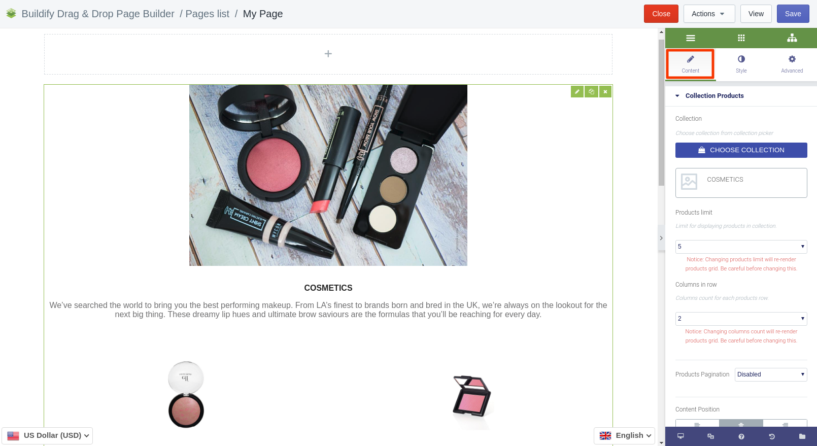
Content Settings
- Select the collection.
- Set the limit of products to be displayed in the collection.
- Set the number of columns in a row.
- Enable pagination.
- Set the position of the content.
- Show or hide the main image of the collection.
- Add the link that will connect the page with the collection.
- Add the image of the collection.
- Set the title and Alt text of the image.
- Enter the title of the collection and the description.
Style Settings
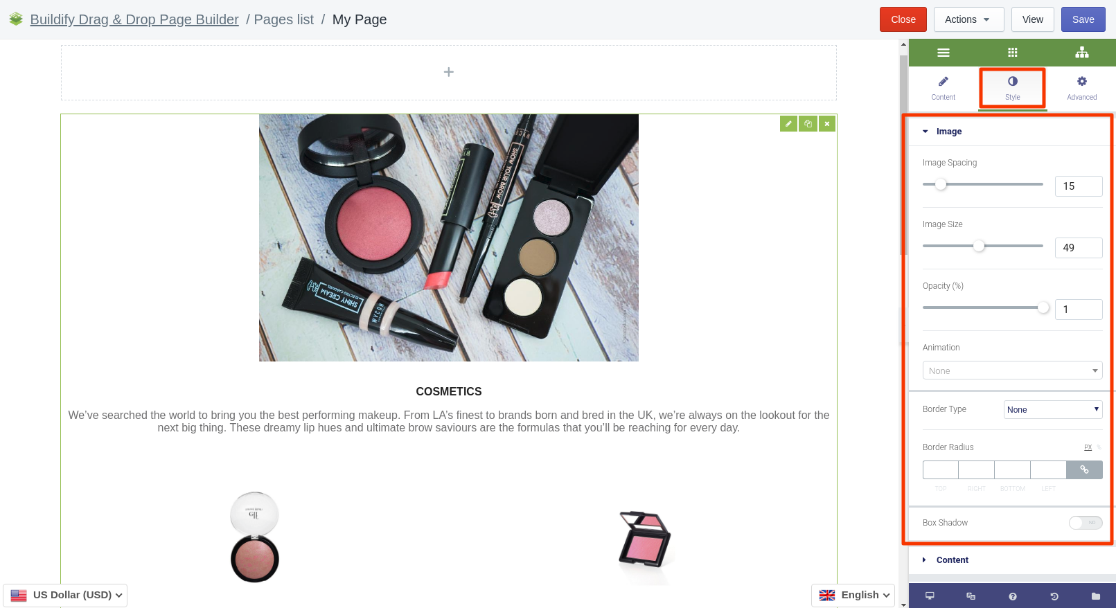
Image
Here you are able to set up:
- Spacing between image and text.
- Image size.
- Image opacity.
- Animation of the image appearance.
- Border type and radius.
- Box shadow.
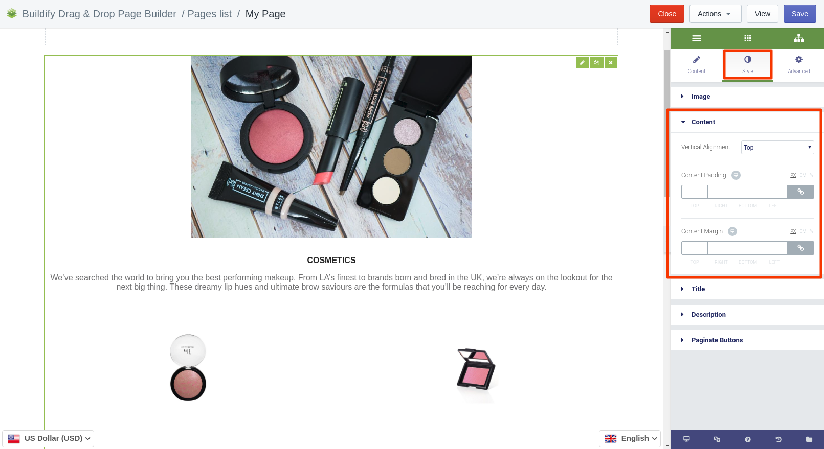
Content
Here you are able to set:
- Vertical alignment.
- Content padding.
- Content margin.
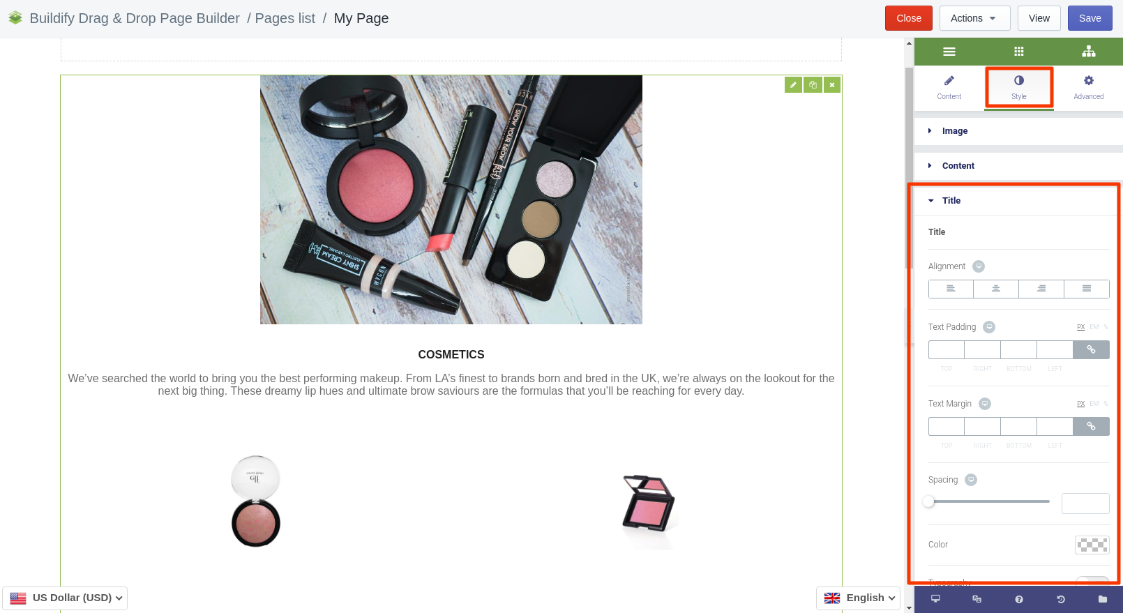
Title
In this section you can set up:
- Alignment of the title.
- Title padding and margin.
- Spacing between description and title.
- Title color.
- Typography - set size, font, style, letter spacing, etc.
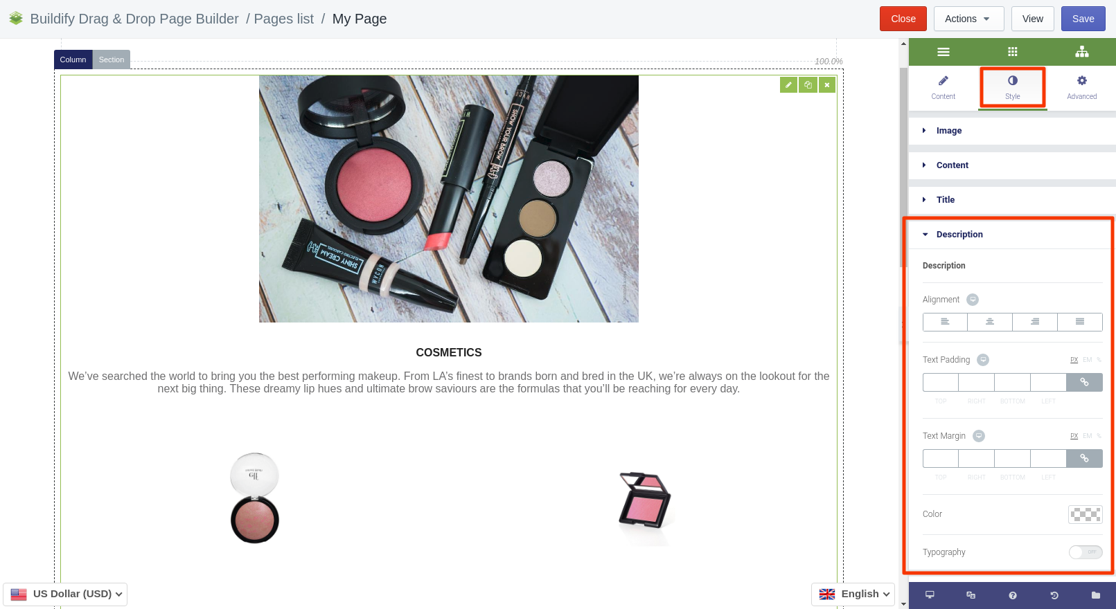
Description
In this section you can set up:
- Alignment of the text
- Text padding and margin.
- Text color.
- Typography - set size, font, style, letter spacing, etc.
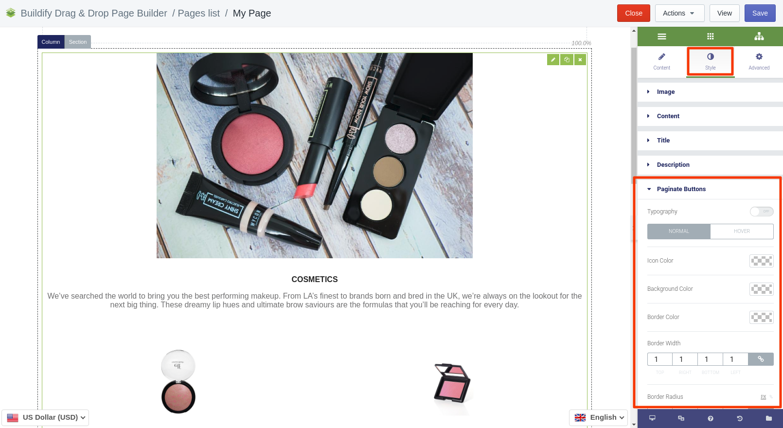
Paginate Buttons
The following setting are available for the Normal position:
- Typography - set size, font, style, letter spacing, etc.
- Color settings - set icon, background, border color.
- Set border width and radius.
- Box shadow - add special effects for the button.
- Buttons margin.
The following setting are available for the Hover position:
- Color settings - text, background, border color.
- Animation - set the animation of the section.
- Border width and radius.
- Box shadow - add special effects for the button.
- Text padding.
- Buttons margin.
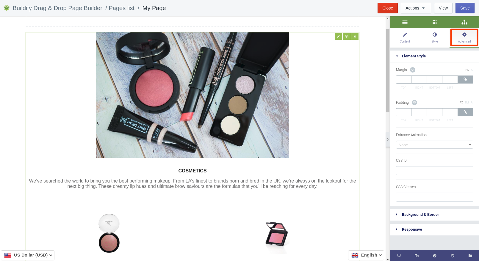
Advanced Settings
- Element Style (margin, padding, entrance appearance).
- Background & Border (type, radius, box shadow).
- Responsive (hide or show it on a desktop, tablet, mobile).
