Rated as 0 (0 Votes)
Contact Form widget
Enforce the page with a contact form, so that customers could contact you any time convenient to them.
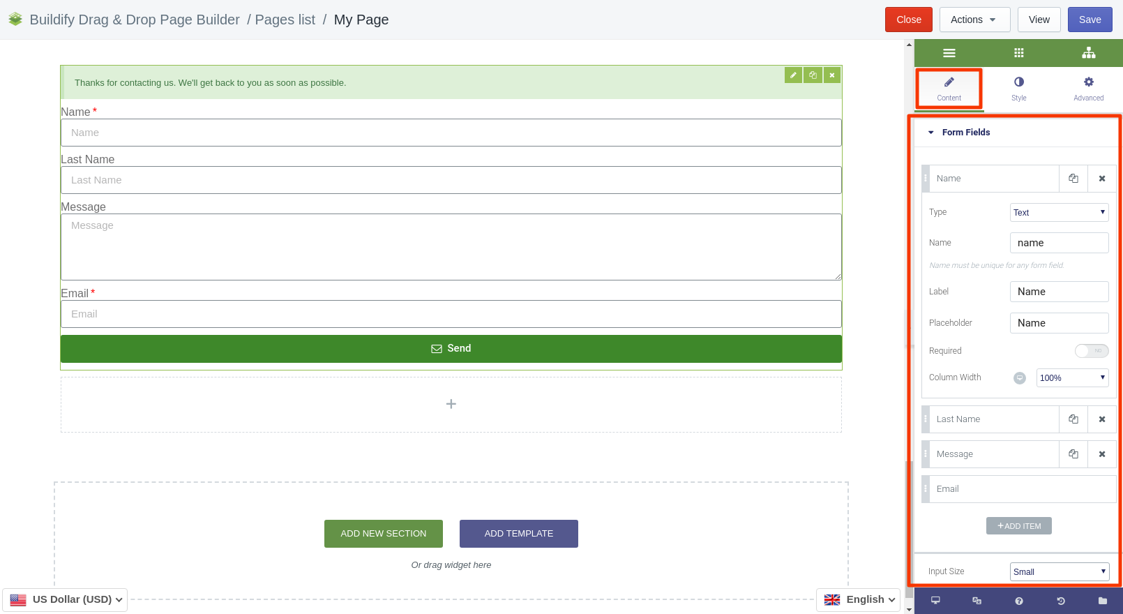
Content Settings
Form Fields
To update/add new/delete fields, click on the field and make use of the settings in the settings bar on the right:
- Set the type of the field (telephone, text, email, etc.).
- Suggest a name for the field.
- Set the label and placeholder (they must be similar to the name).
- Required - mark the field as required, if need be.
- Set the width of the column.
Customize every field separately in the same way. Also, here you can set up:
- Input size.
- Labels - show or hide labels.
- Required marks - showe or hide required marks.
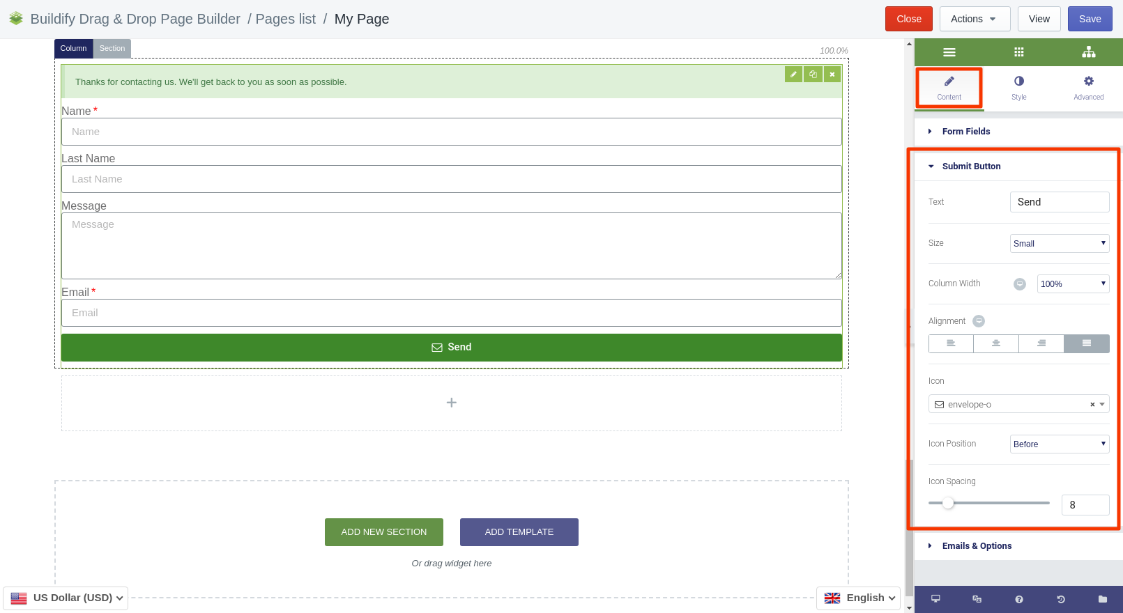
Submit Button
The Submit button has the following settings:
- Text - enter input text of the button.
- Size - set the size of the button.
- Column width - set the width.
- Alignment - set button's position in the section.
- Icon - select icon for the button.
- Icon position - set the icon before of after text.
- Icon spacing - set the distance between text and icon inside the button.
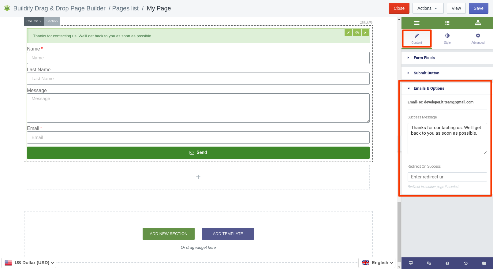
Email & Options
Here you can enter the text of the message that will be sent to the Customer after he/she has sent a message to you. Also, you can add a redirect URL. In this case, the message will be redirected to another page.
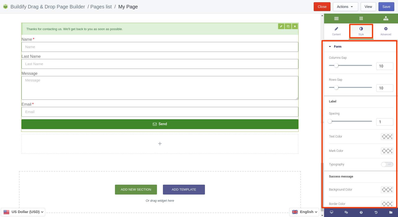
Style Setting
Form
- Set column and rows gap.
- Set spacing, typography, text and mark color for Labels.
- Set border width, typography, text, background and border color for "Success" message.
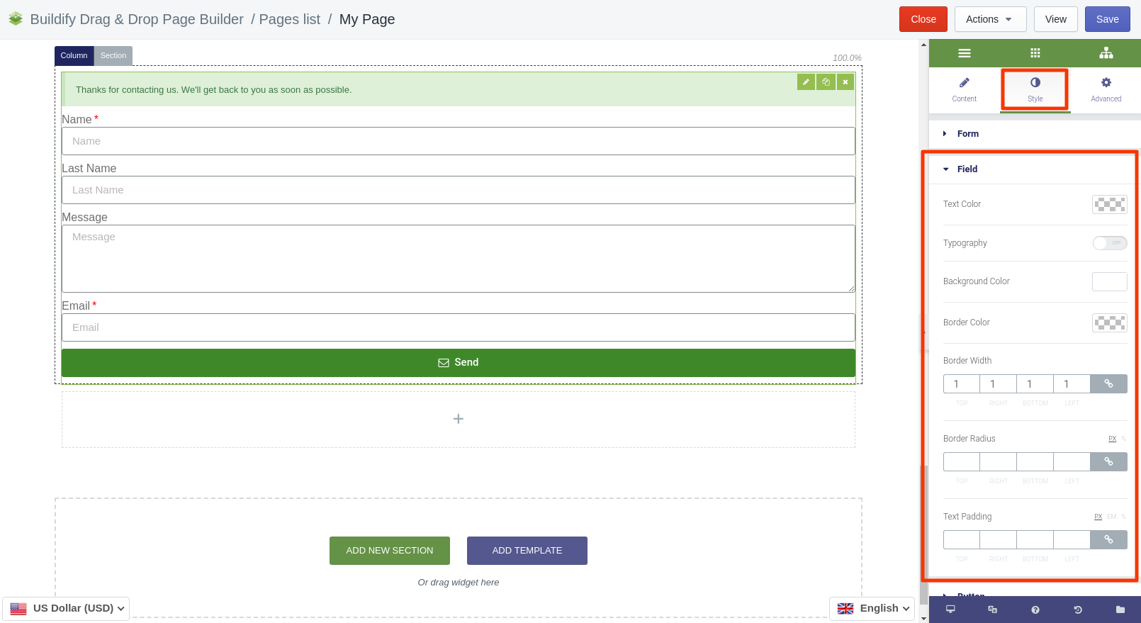
Field
- Set text color.
- Typography - set size, font, style, letter spacing, etc.
- Choose background color.
- Set border color, width and radius.
- Set text padding.
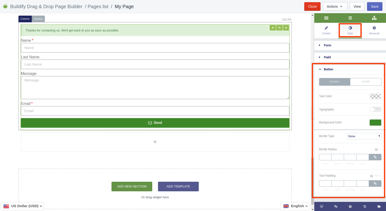
Button
The following setting are available for the Normal position:
- Text and background color
- Typography
- Border type and radius
- Text padding
The following setting are available for the Hover position:
- Color settings - text, background
- Animation - set the animation of the section.
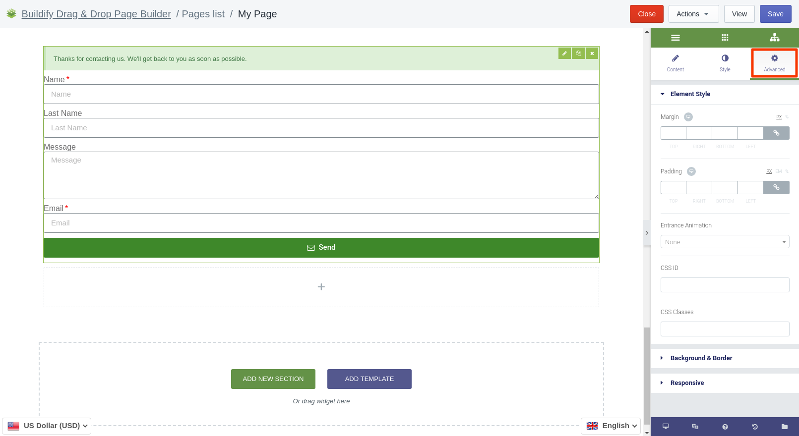
Advanced Settings
- Element Style (margin, padding, entrance appearance).
- Background & Border (type, radius, box shadow).
- Responsive (hide or show it on a desktop, tablet, mobile).