Rated as 1 (1 Vote)
Modal Section
The modal window is intended to display all sorts of information. Read here how you can employ it for your store.
The widget allows displaying the modal window in following situations:
- Timeout: will be displayed after the specified time.
- Window leave: will be displayed when the cursor leaves the window.
- Hover element: will be displayed when the cursor hovers over the element .
- Click element: will be displayed on clicking on the selected element.
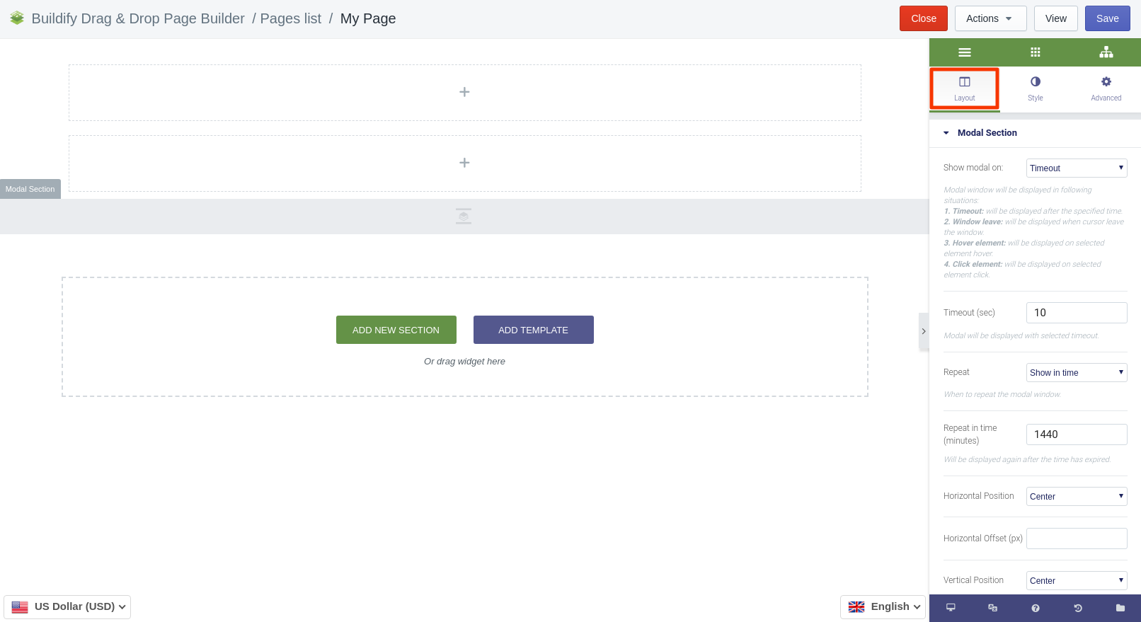
Layout Settings
The following settings are available here:
- Set timeout (sec) - the modal window will be displayed with the selected timeout.
- Choose when to repeat the modal window.
- Set the time period after which the modal window will emerge again.
- Choose the horizontal position: center, top, bottom.
- Set the horizontal offset.
- Choose the vertical position: center, top, bottom.
- Set the vertical offset.
- Set the width of the modal window.
- Decide whether the modal window is to close on clicking on the outside area of the window.
- Decide whether to show or hide the Close button.
- Set the margin between the columns.
- Set the height of the modal window.
- Select the position of the content within the window.
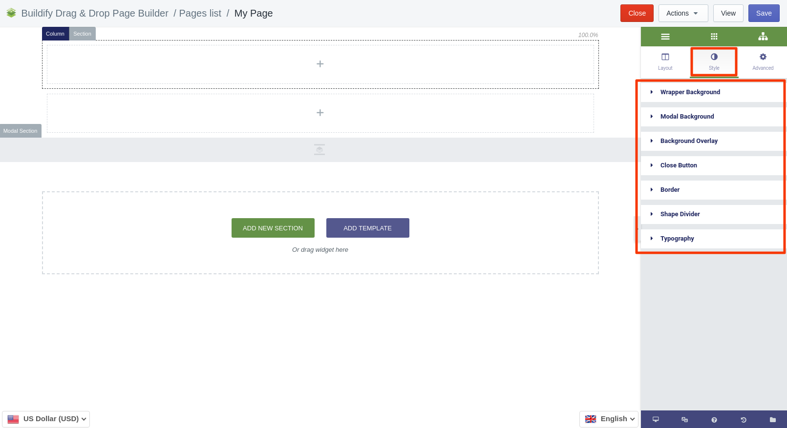
Style Settings
- Set the background color.
- Choose the background type, color and image.
- Choose the background overlay type.
- Set the color, size, margin and icon of the Close button.
- Set the border type, radius and turn the box shadow on or off.
- Choose the type of the Shape divider.
- Typography - configure the settings for the heading, text, link, link hover.
- Set the alignment of the text.
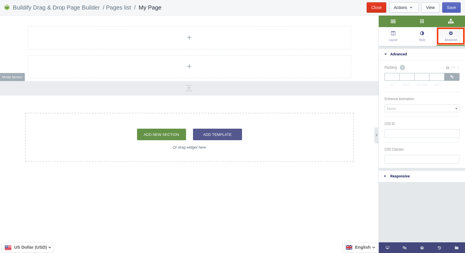
Advanced Settings
- Advanced (padding, entrance animation, CSS ID, CSS classes).
- Responsive:- Reverse column order - when the column order is reversed, the last column appears on top and vice versa.- Visibility - decide on which device the window is to be shown: desktop, tablet, mobile.