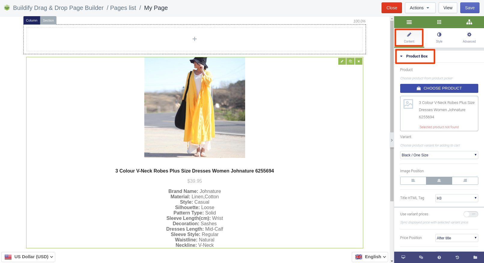
Product Box widget
Place products onto the page and support them with titles, descriptions and images.
Content Settings
Product Box
To customize the widget, add a product to Cart. Do that in the Content section. Press the Choose Product button and select a product and product variant.
-
Set the alignment of the image.
-
Set the HTML tag.
-
Turn on or off the variants of prices.
-
Set the position of the price.
-
Add text before or after the price.
-
Enter the price of the product.
-
Enter the discount, if you are planning to give one.
-
Add the link to the product.
-
Upload the image of the product.
-
Enter the title of the image and the Alt text.
-
Enter the title and description of the product.
-
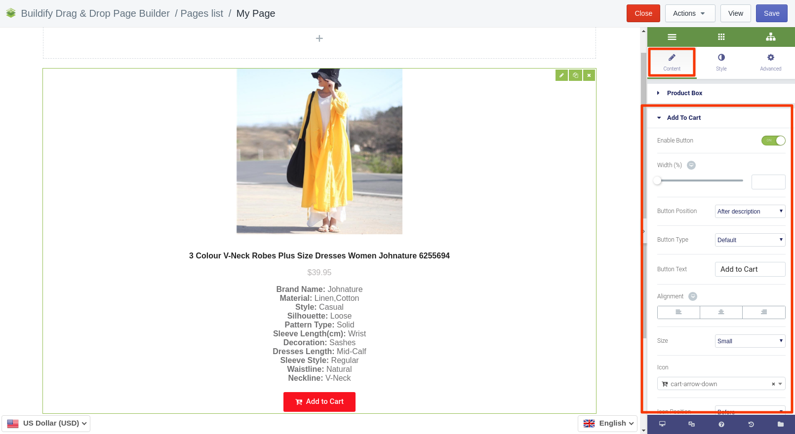
Add to Cart
-
Alignment - the position of the button on the page.
-
Width - the width of the button.
-
Product and variant - choose a product and a variant of the product.
-
Button type - the color of the button.
-
Button text - the text on the button.
-
Button size - the size of the button (extra large, large, medium, small, extra small).
-
Icon - the icon of the button.
-
Icon position - the position of the icon: before or after the text.
-
Icon spacing - set the distance between the text and the icon.
-
Additional products - allow submitting additional products.
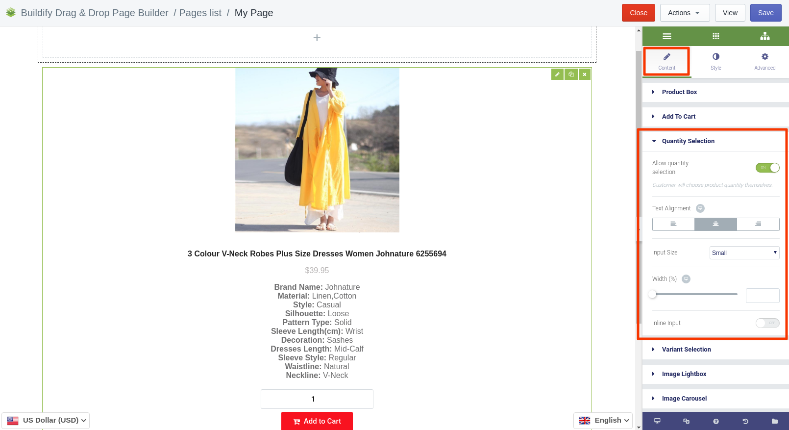
Quantity Selection
If you enable quantity selection, customers will be able to indicate the quantity of the product by themselves. You will then need to set:
-
text alignment;
-
input size;
-
width;
-
position (put the button under or inline with Add to Cart button).
Variant Selection
Enable selection of variants, if there are any for the product, and if you want customers to choose variants themselves.
-
Position - set the position of the selected section.
-
Width - set a width of the button.
-
Text alignment - set text alignment inside the button.
-
Selection size - set the size of the selection section.
-
Button unavaible - enter appropriate text.
-
Button sold out - enter appropriate text.
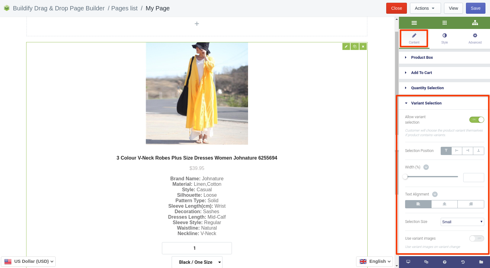
Image Lightbox
Lightbox is a script used to overlay images on the page.
Here you can set up the following parameters of Lightbox:
-
color;
-
content width;
-
content position;
-
entrance animation.
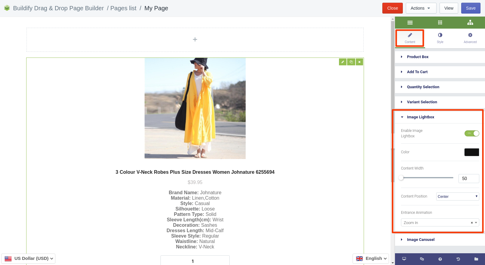
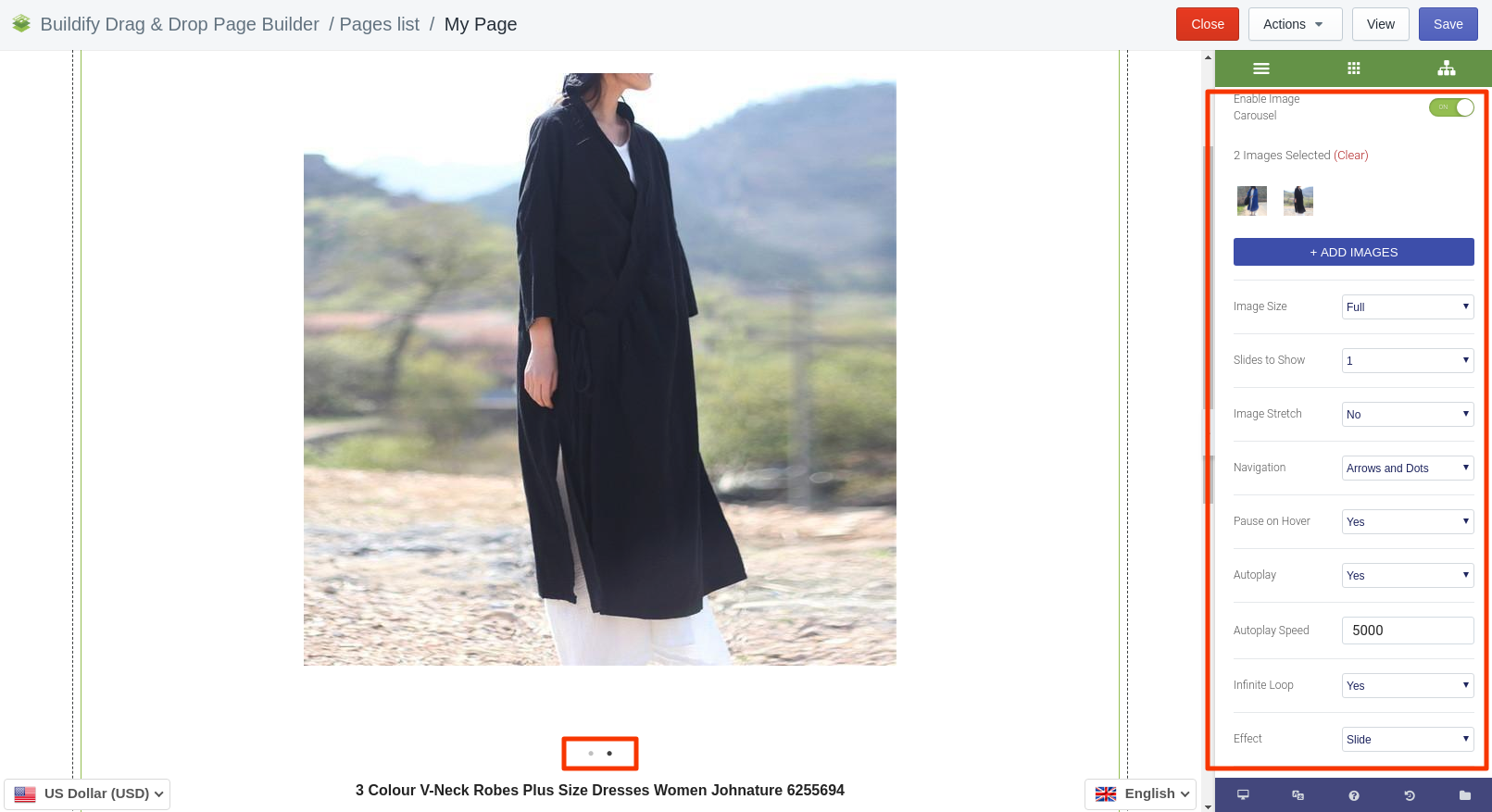
Image Carousel
If you have variants of products or multiple photos of the product, employ the Image Carousel option to have them scrolling automatically on your page.
Enable image carousel and make appropriate settings.
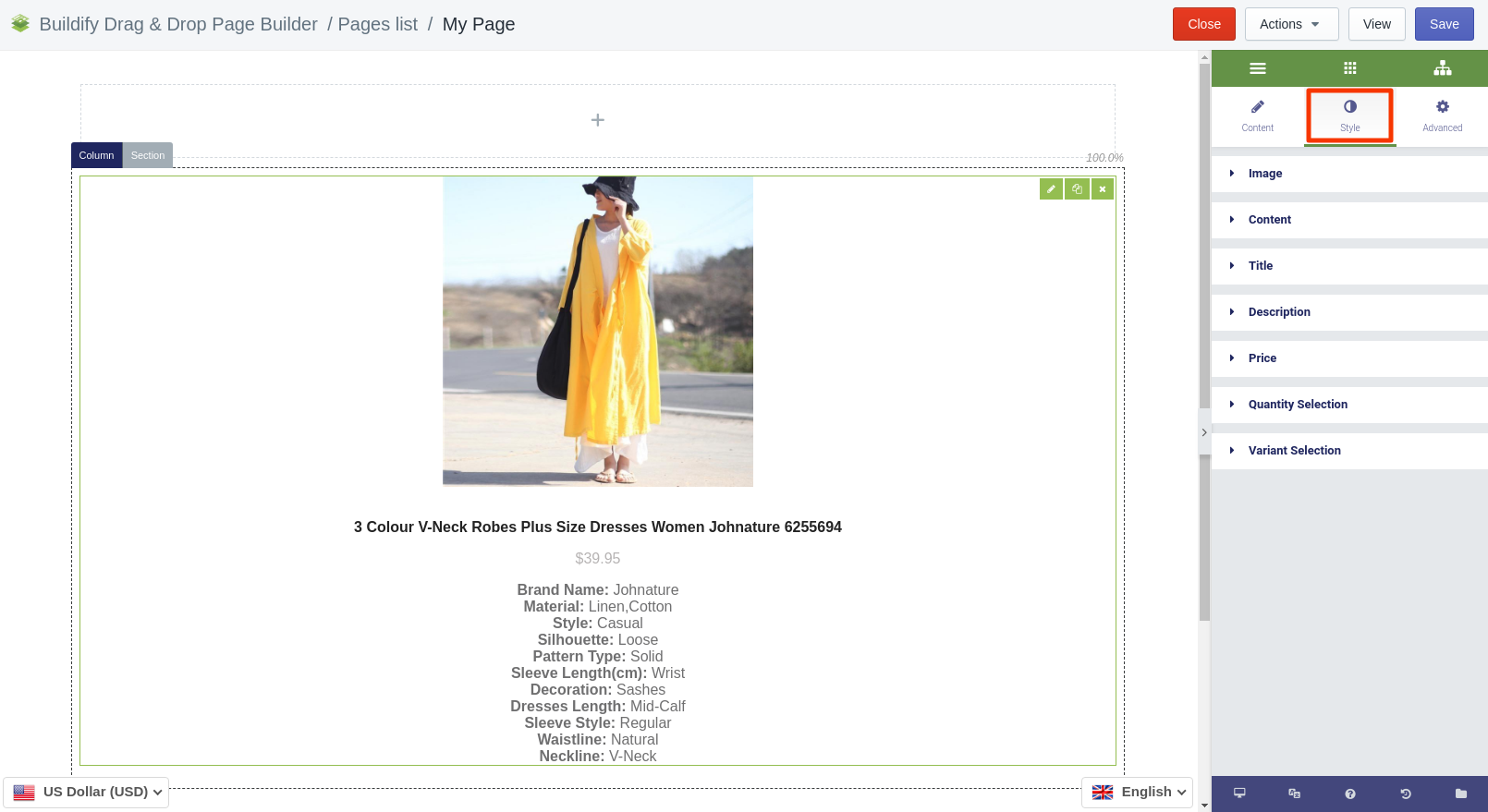
Style Settings
In this section you can configure the settings of the following:
-
Image
-
Content
-
Title
-
Description
-
Price
-
Quantity selection
-
Variant selection
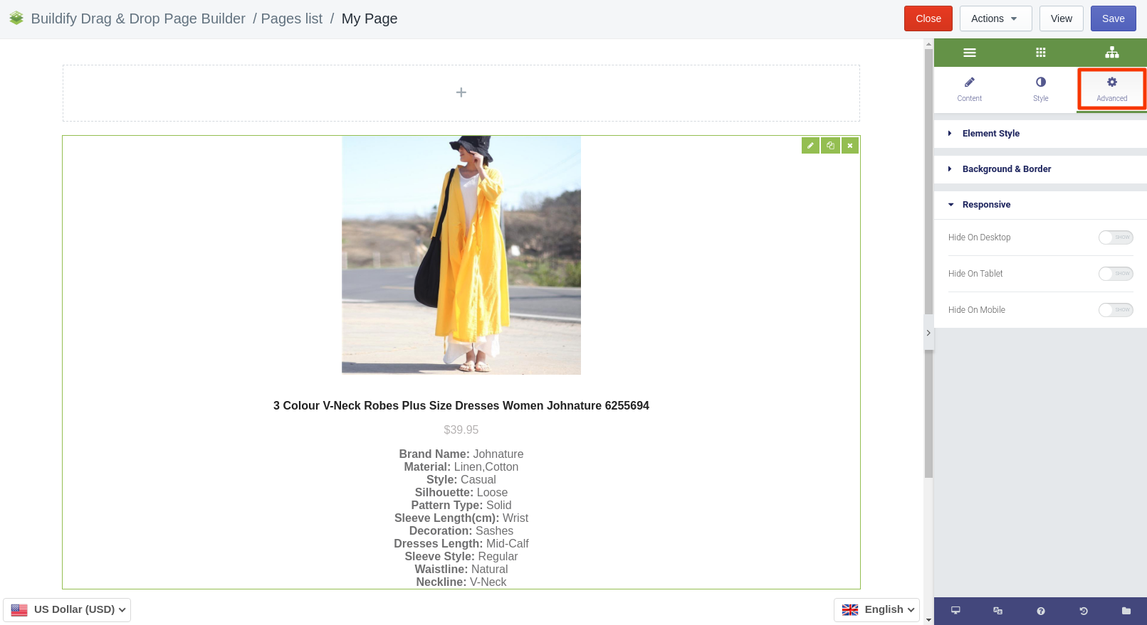
Advanced Settings
-
Element Style (margin, padding, entrance appearance).
-
Background & Border (type, radius, box shadow).
-
Responsive (hide or show it on a desktop, tablet, mobile).