Rated as 0 (0 Votes)
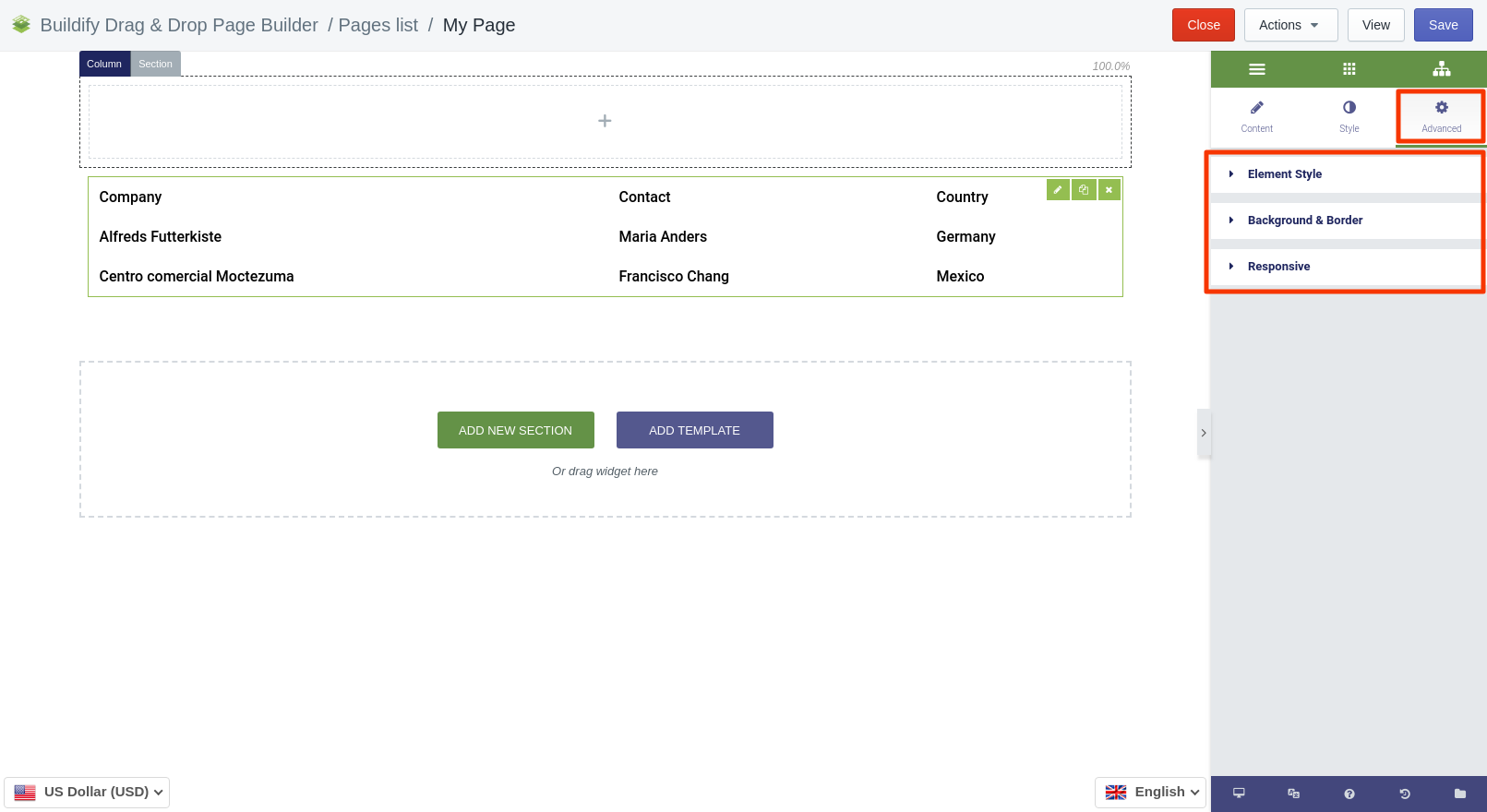
Table widget
Organize content into rows and columns with the help of the Table widget.
Table widget is used to organize data into rows and columns.
Content Settings
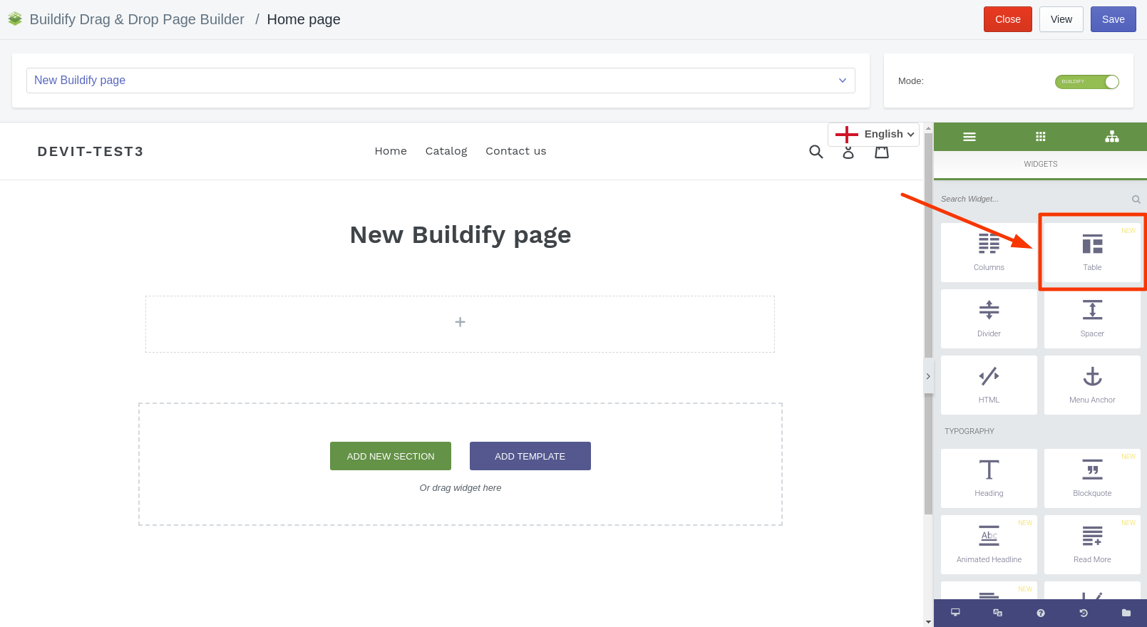
Header
- Sortable - Enables sorting rows by clicking on header cells.
- Hide on mobile - show or hide on mobiles.
- Auto mobile headers - try to automatically fetch corresponding headers on mobile. Works only when column span values are not used.
- Mobile display - set how columns will look on the mobile phone.
- Rows - edit every row separately.
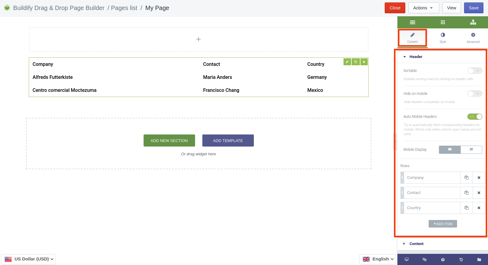
Content
Here you will find a list of rows, where you can set a type of element and enter CSS ID and CSS Classes.
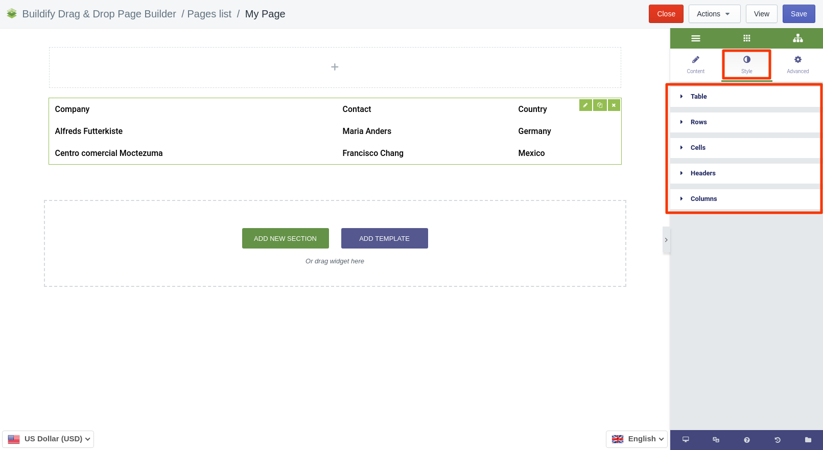
Style Settings
Table
- Set maximum size.
- Set alignment of the table.
- Set transition duration.
Rows
- Set border type: solid, double, dotted, dashed or none.
- Set alternate: even or odd.
- Choose color and background color for default and hover position.
Cells
- Typography - set size, font, style, letter spacing, etc.
- Set the main color and background color.
- Set padding.
- Set alignment for the text.
- Choose border type: solid, double, dotted, dashed or none.
Headers
- Set mobile width.
- Make typography settings - set size, font, style, letter spacing, etc.
- Set the main color and background color.
- Set padding.
- Choose border type: solid, double, dotted, dashed or none.
Columns
Set column rules:
- Set number of spans.
- Choose background color.
- Choose border type: solid, double, dotted, dashed or none.
- Set width of the column.
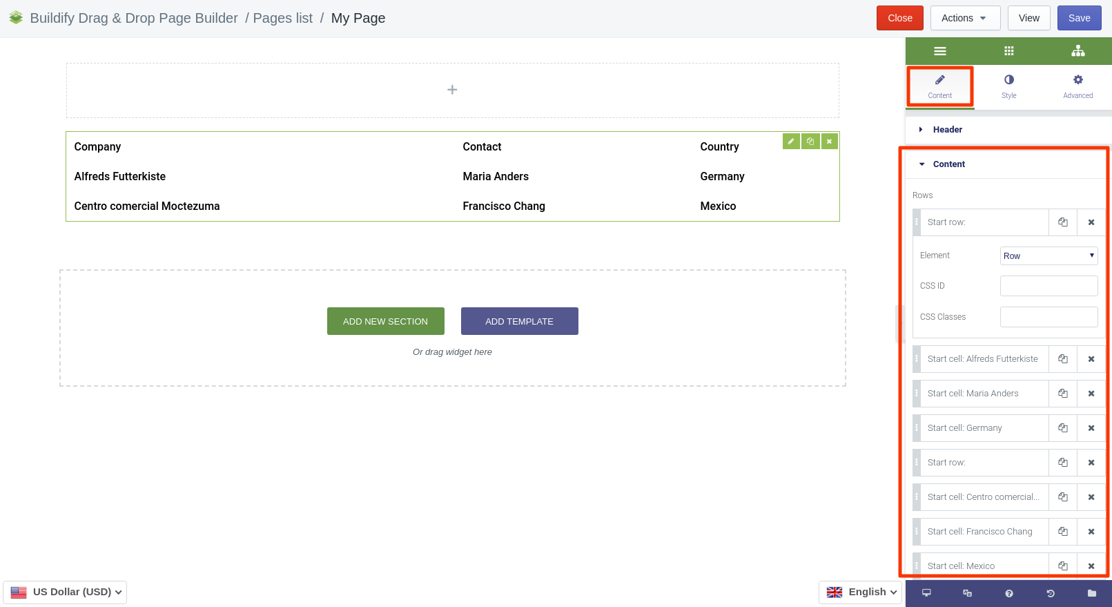
Advanced Settings
- Element Style (margin, padding, entrance appearance).
- Background & Border (type, radius, box shadow).
- Responsive (hide or show it on the desktop, tablet, mobile).
