Rated as 1 (1 Vote)
Grid System
Study what you can do with the elements of the page.
Buildify has a responsive grid system, made up of Sections and Columns. They are the central elements for designing the layout of a page.
Add columns first, then place content elements into the columns. An area of columns is called a section. Each section can have its own background color, image, or video.
Available column settings:
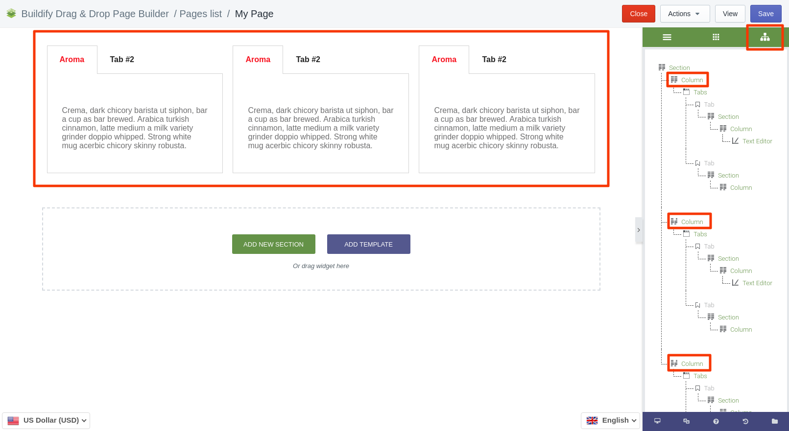
- Duplicate - opt for Duplicate to get multiple (max 6) columns within the structure. The columns will be added vertically. You will be able to see on the Elements Tree that all the elements have the same structure.

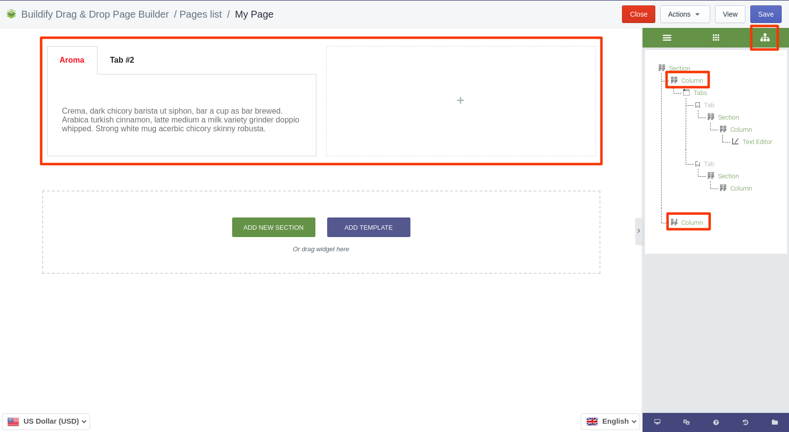
- Add - opt for Add to add columns. The columns are added empty of content. In the picture below you can see two different columns.

- Remove - click on the red cross if you want to delete the column.
Available section settings:
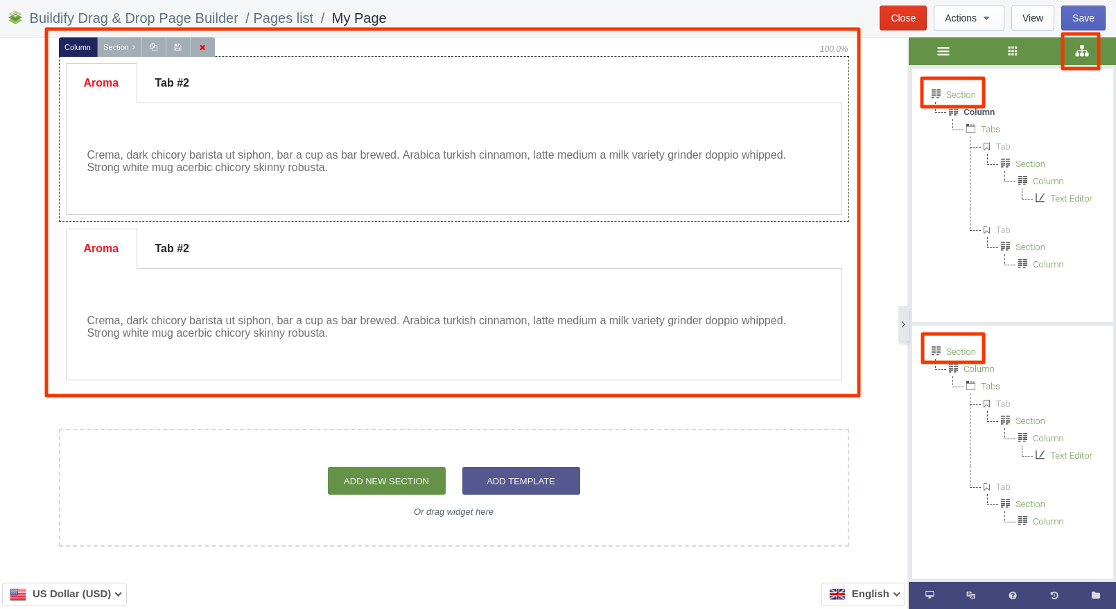
- Duplicate - opt for Duplicate to get multiple (max 6) sections within the structure. The sections will be added horizontally. All sections will have an identical structure.

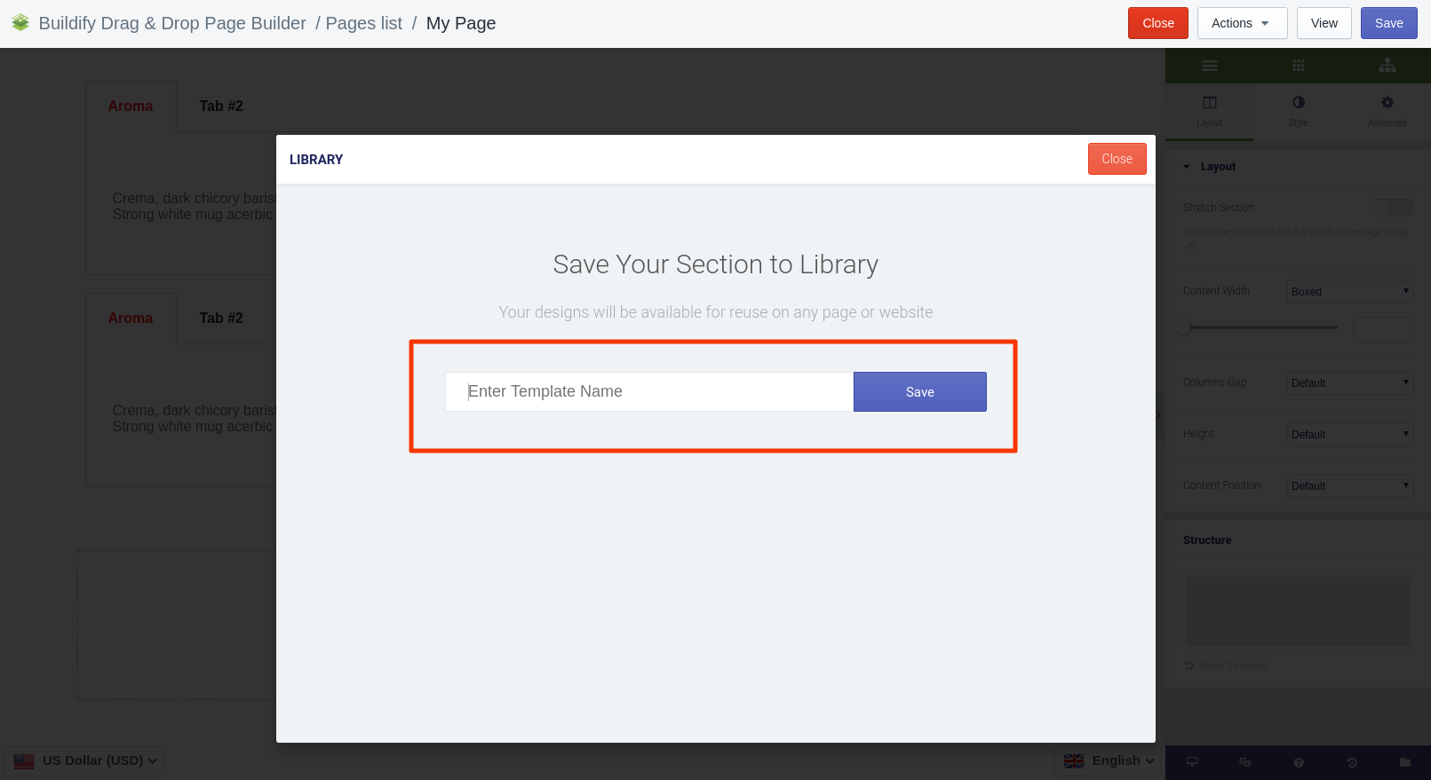
- Save - this button allows you to save the section to the library. Enter the name of the template and click Save. Now this template is in the library and can be used anytime you need.

- Remove - click on the red cross if you want to delete the section.
Watch the video to learn more:
Attached files: samsung.jpg